
Creating a design system
Though a well established company, TripAdvisor’s design system was in shambles. 2018 was about building out a sustainable, scalable system.
Overview
Creating a brand isn’t just about a logo and two or three colors. A brand focuses around the way typography is used, the meaning behind colors, and the various actions a user needs to take. A well-designed system is smooth and consistent across pages, be it 5 or 195.
The Pieces
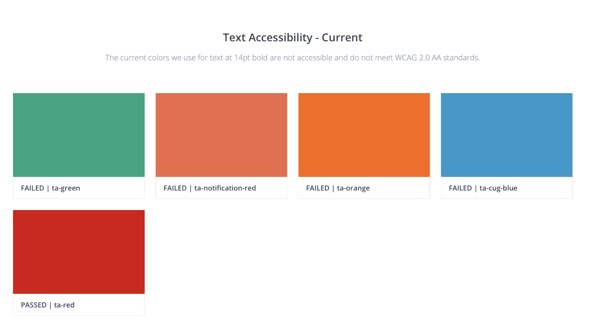
Accessibility
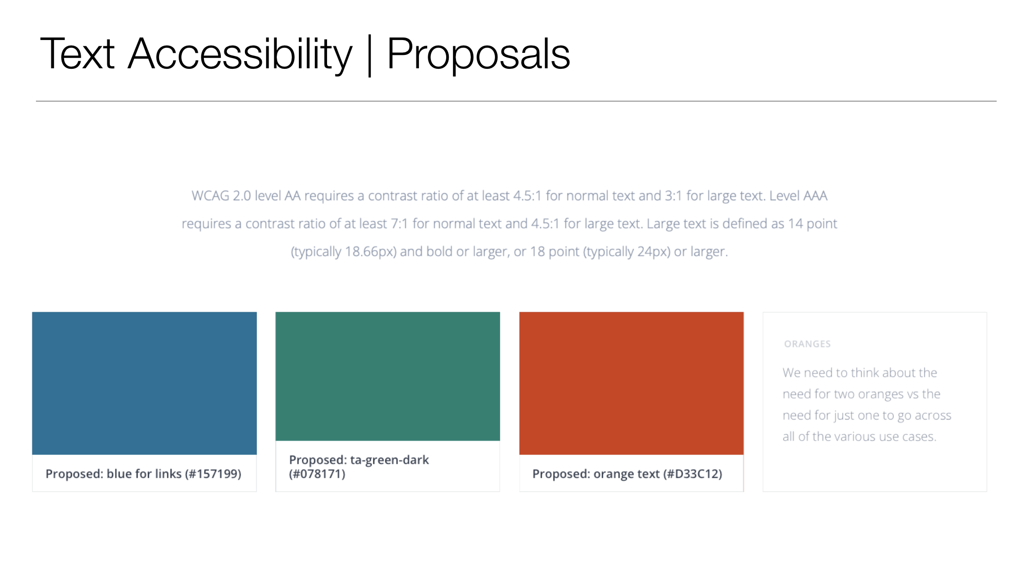
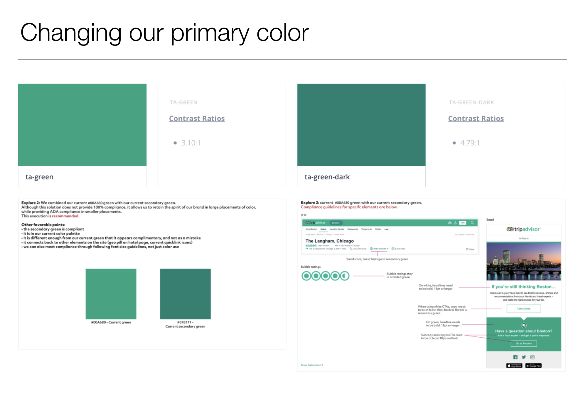
WCAG AA Compliance
A website can’t just be “pretty.” It needs to follow proper standards to give all users an equal playing field.
Web accessibility allows for all potential users, from those who are blind to those who don’t have the ability to use a keyboard or mouse to those who are fully capable, to use the internet.
When thinking about accessibility, we need to consider color contrast, functionality (i.e., tab navigation), SEO (headers for screen readers), and tap targets for those with motor challenges.
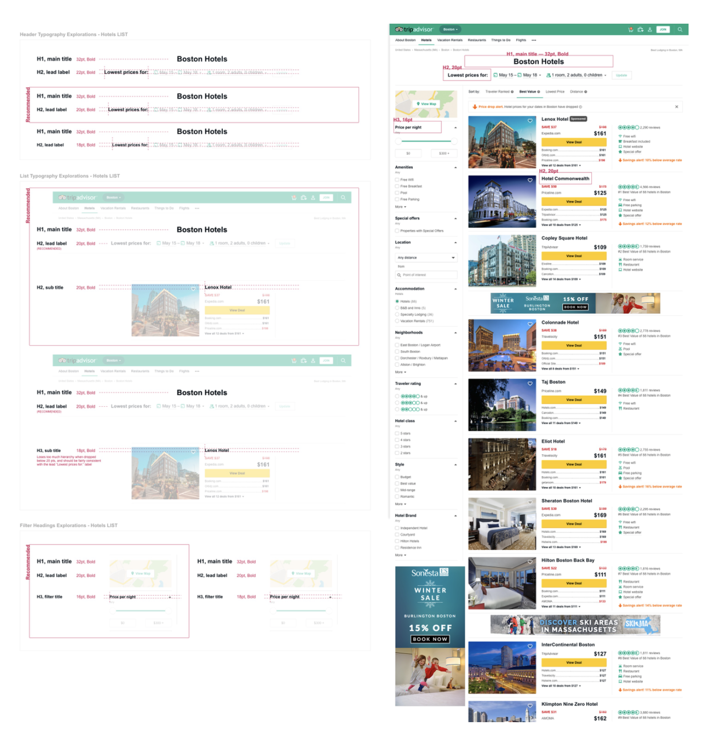
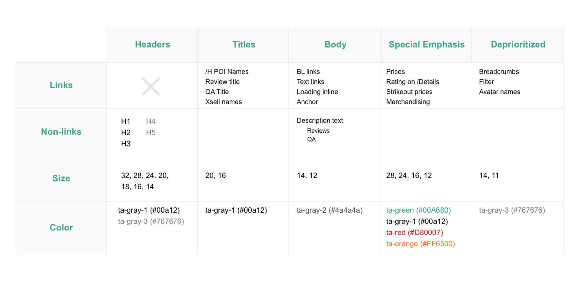
Typography
Consistency across business units
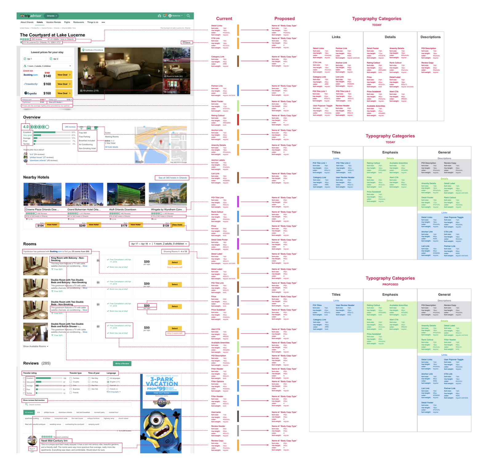
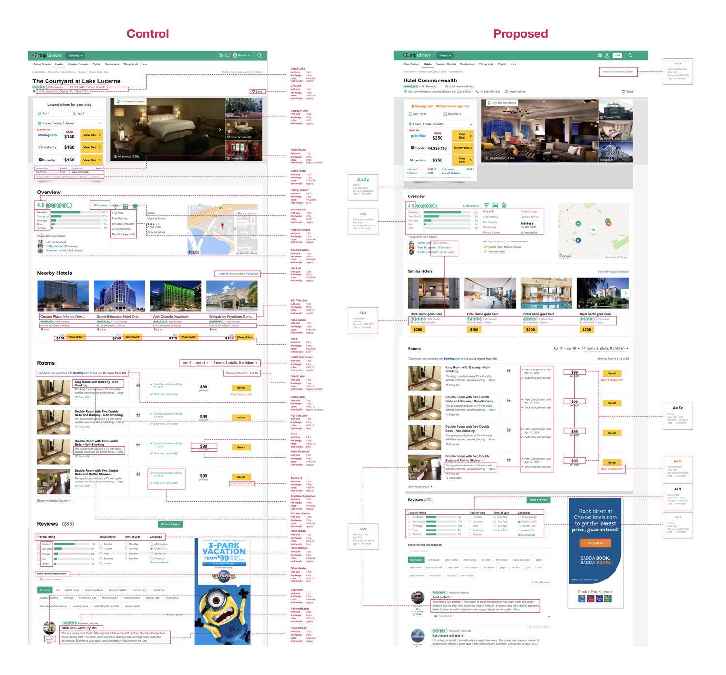
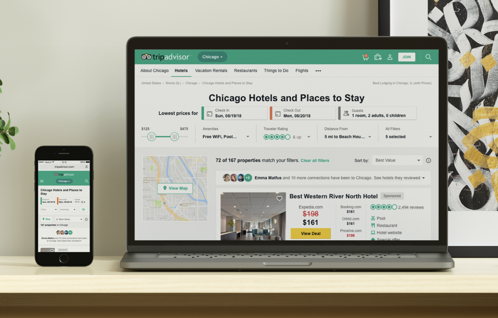
When I started at TripAdvisor, it was clear that there was a lack of a typographic system across business units.
Over the course of a month, I went through every major page of TA and gathered all the various header styles as well as body copy. Once I had a comprehensive view of all of the inconsistencies, I brought forth proposals, as well as comparisons, to show what a unified TA could look like.
Color
Giving color a meaning
Color is great. It can give a design a voice. It calls attention to errors or special alerts. It adds contrast and a sense of brand.
Color, however, cannot just be used. It needs to have a purpose and it needs to be consistent. If green, for example, is only used for links, then it shouldn't be added in other elements of a page. Yellow may be used for commerce buttons... users don't need the extra work of understanding what colors mean if there is a solid system that provides a clear purpose across a product.
Color and Accessibility
Typography
When I started at TripAdvisor, it was clear that there was a lack of a typographic system across business units.
Over the course of a month, I went through every major page of TA and gathered all the various header styles as well as body copy. Once I had a comprehensive view of all of the inconsistencies, I brought forth proposals, as well as comparisons, to show what a unified TA could look like.
My work
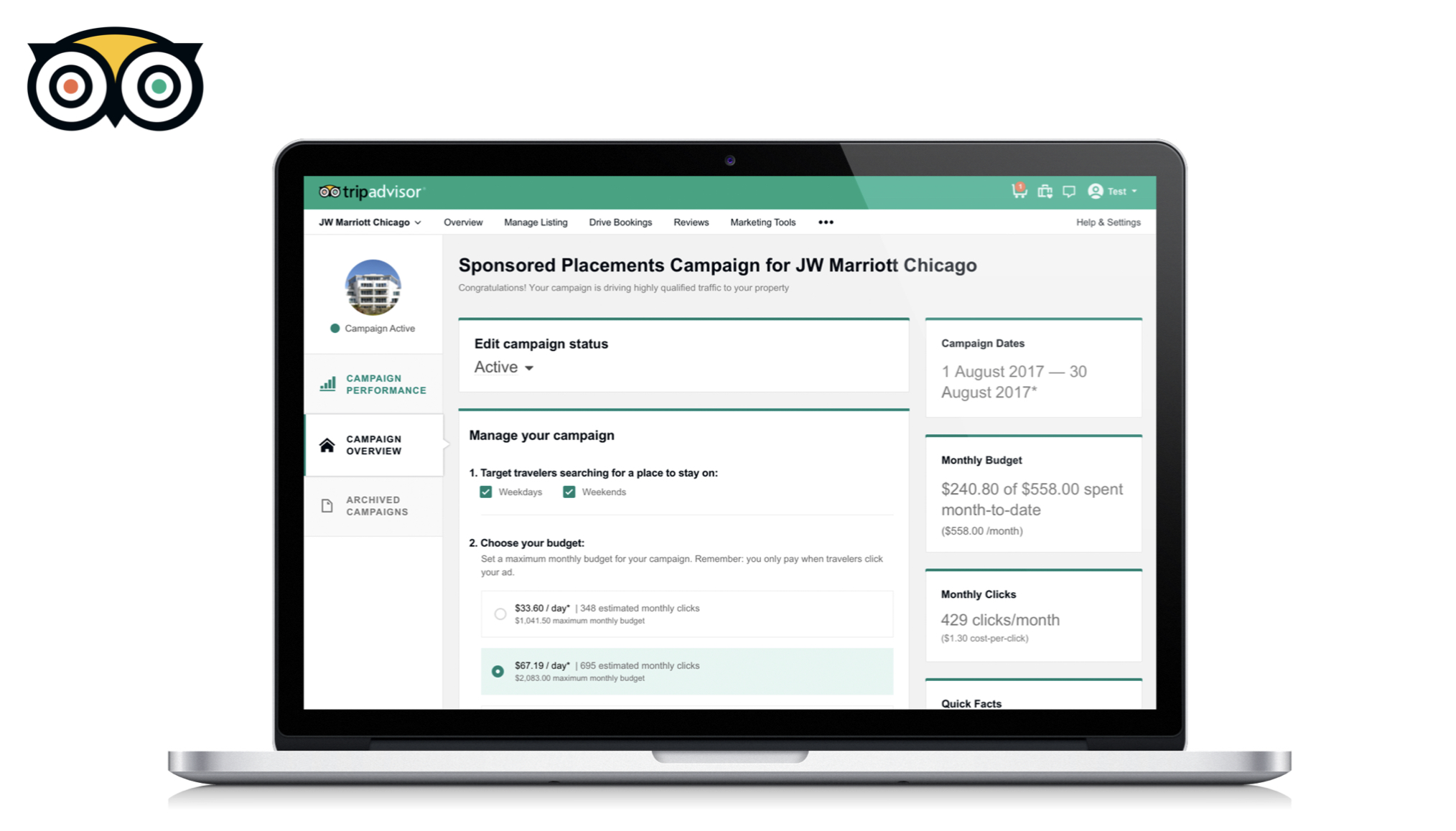
Hotels Business to Business - Phase 1TripAdvisor | Product Design
Creating a Design SystemTripAdvisor | Product Design
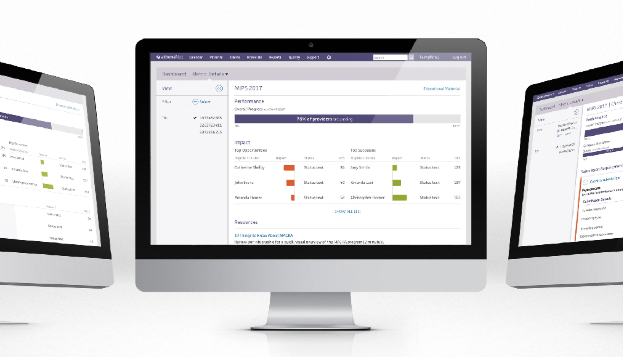
MIPS Performance Dashboardathenahealth | UX Design
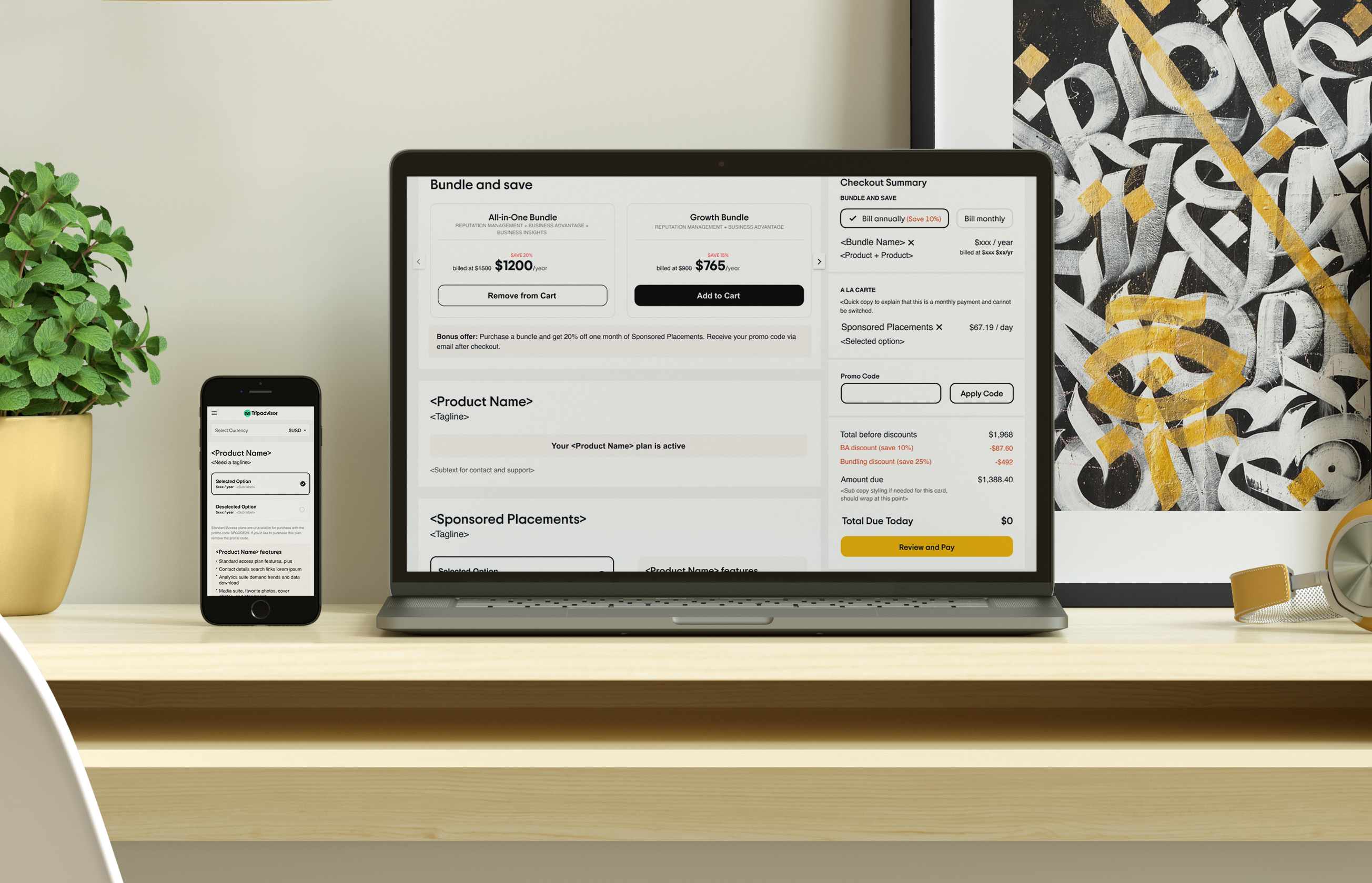
Updating our Unified Purchase PathTripadvisor | Product Design

Reputation ManagementTripadvisor | Product Design