MIPS Performance Dashboard
Overview
CMS has created a new program that started in January of 2017. Practices that are unable to meet the program requirements will be hit with financial penalties.
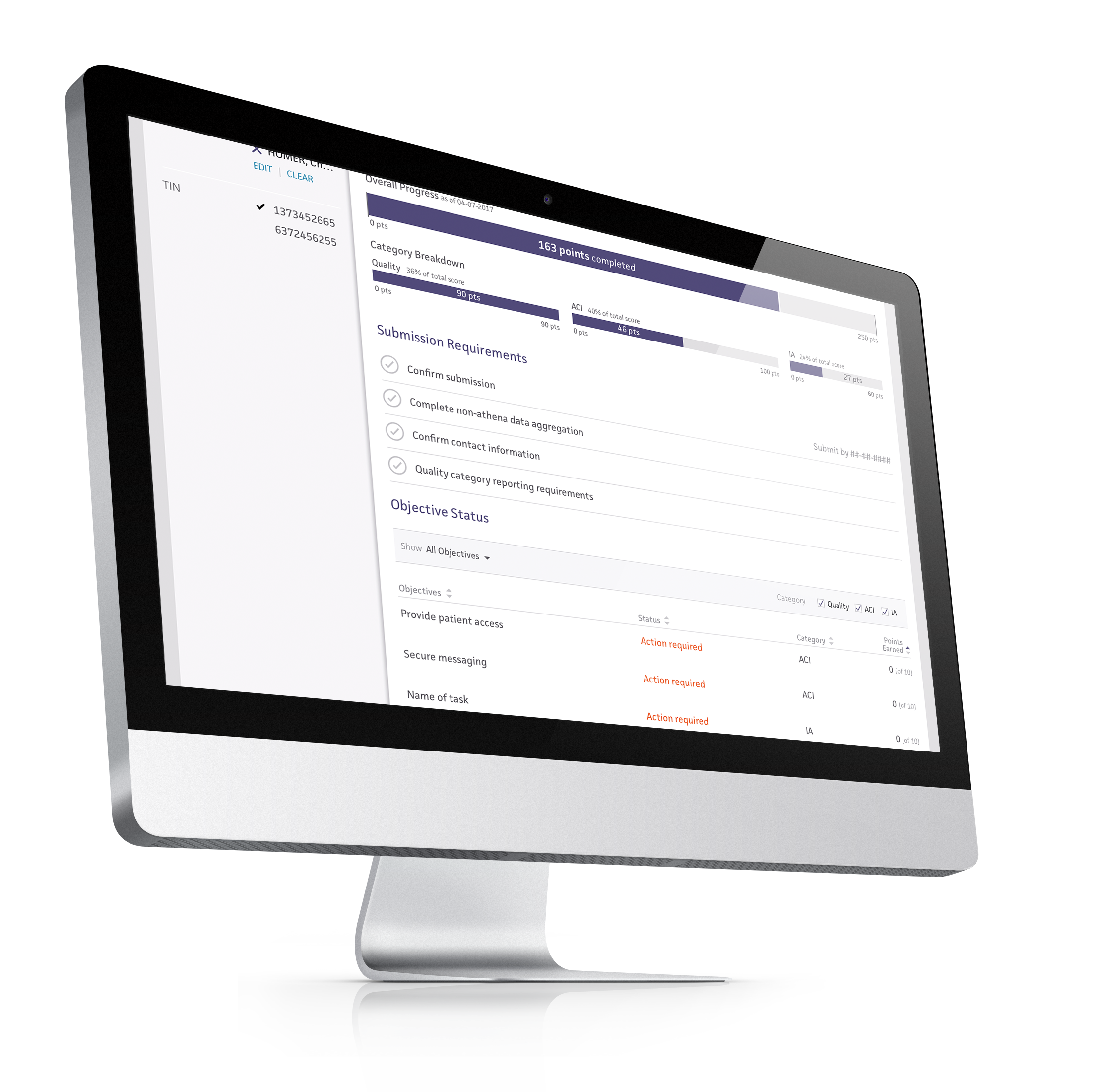
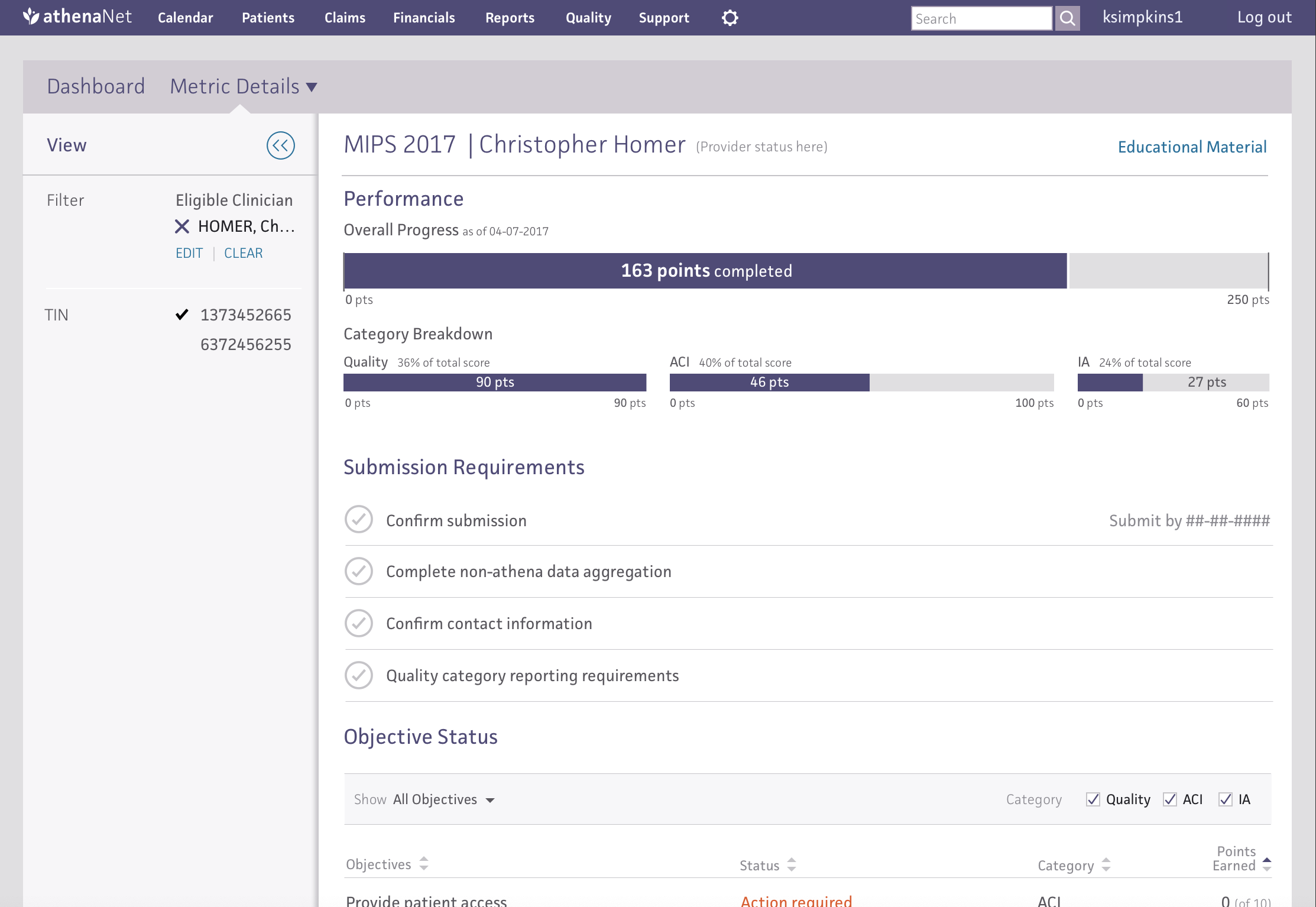
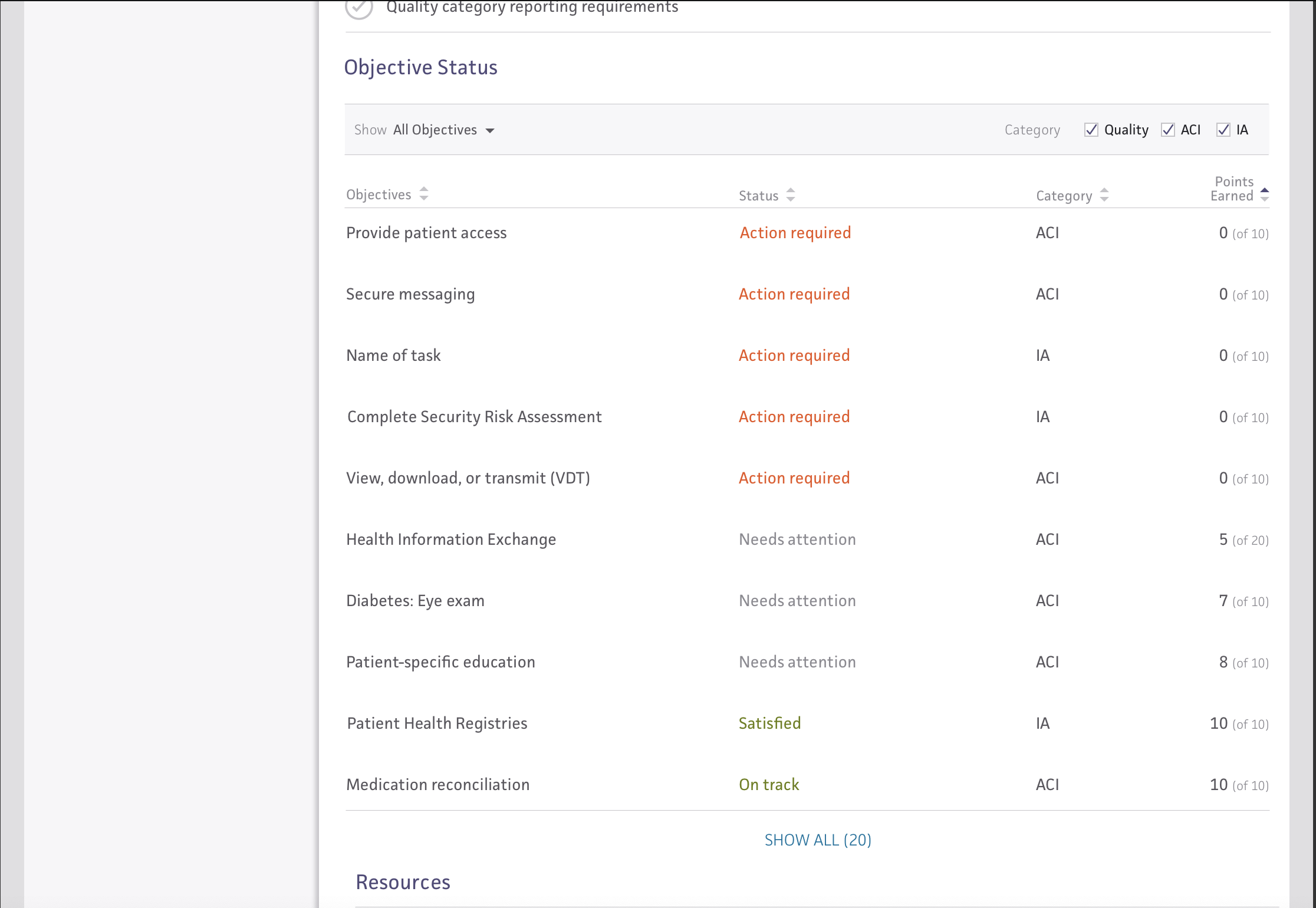
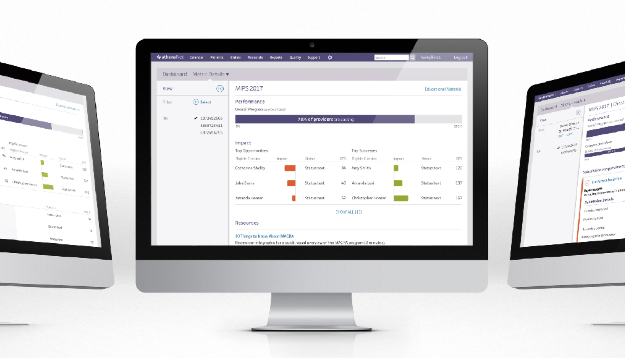
The MIPS Dashboard is a tool to help practice managers and their providers understand how they’re doing in the program and where they need to improve so that they can avoid those penalties.
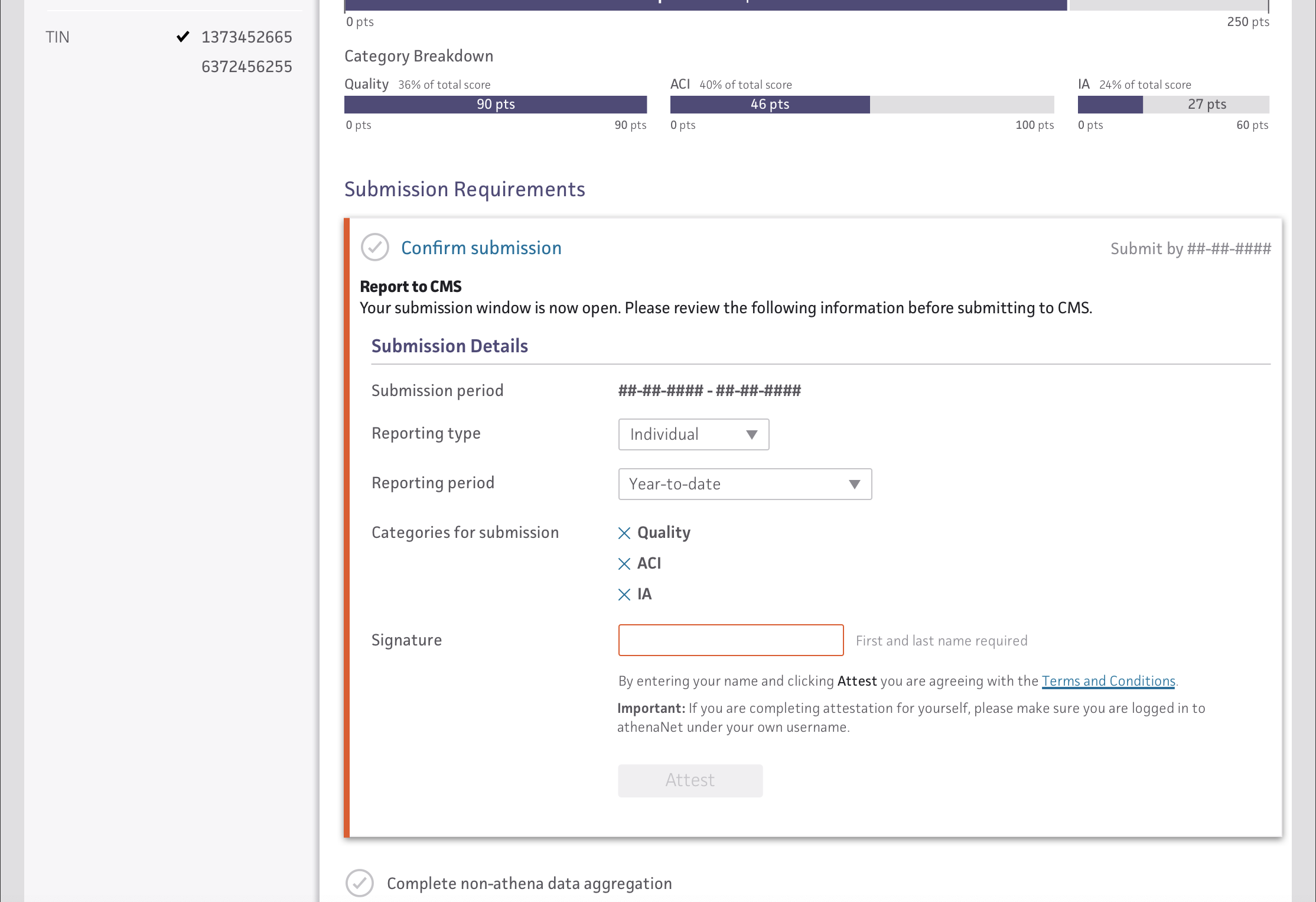
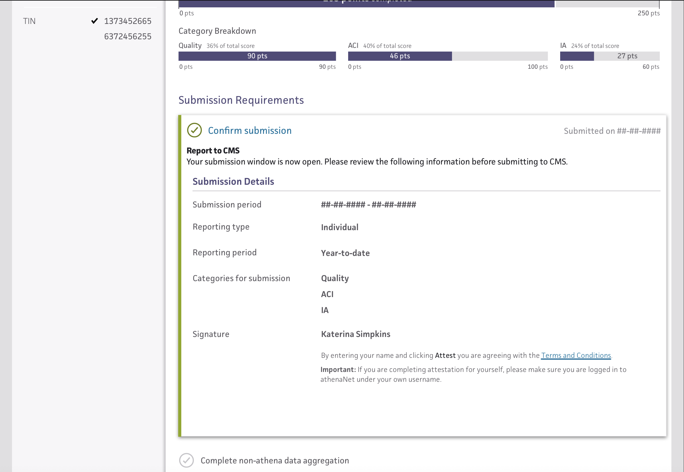
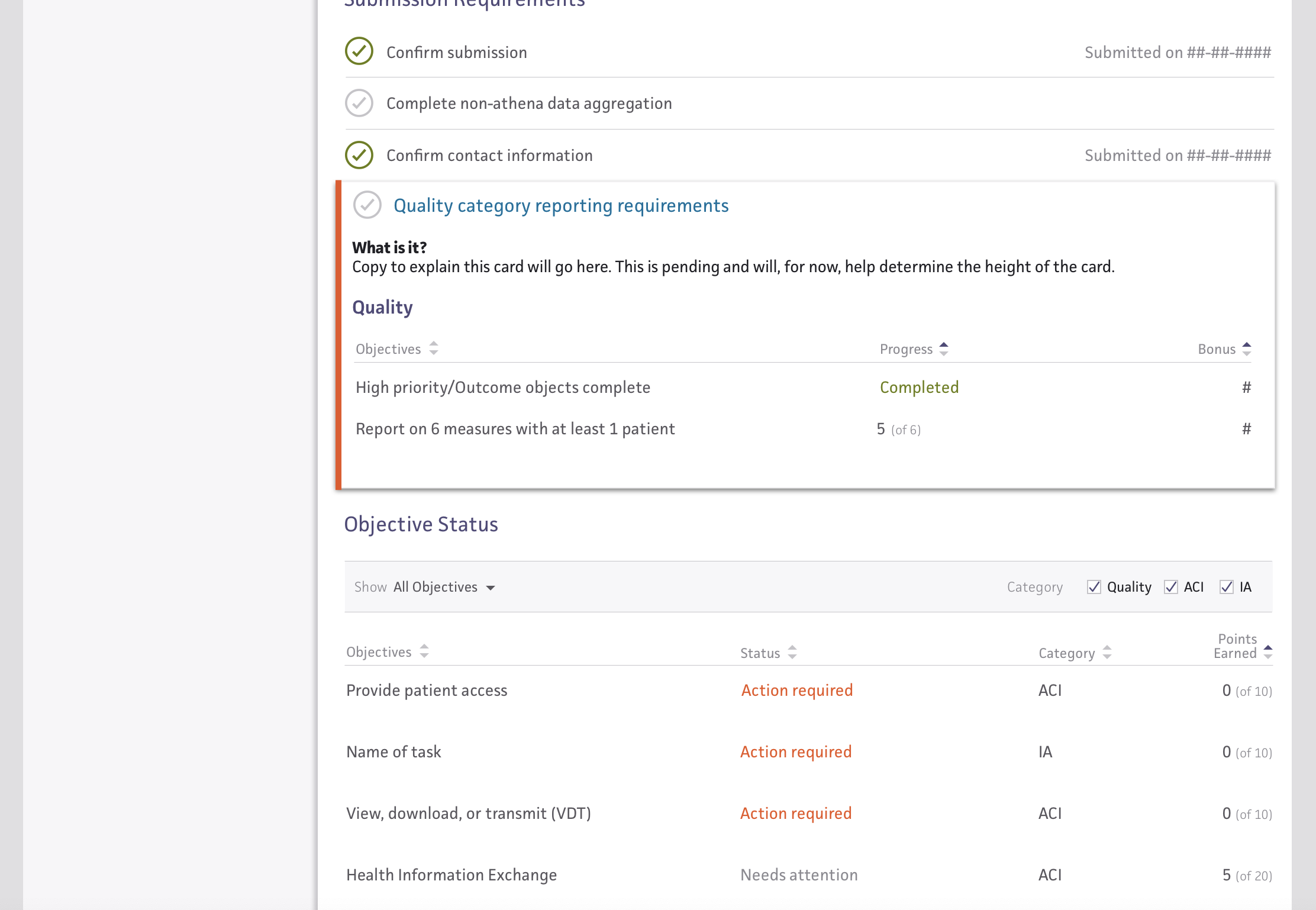
At first glance of the dashboard overview page, a user can quickly see their top and bottom performers and where the practice sits, overall, in its progress towards program completion.
------------------------------------------------------------------------------------------------------------------------------
Want to see more? Check out the working prototype and play around with the dashboard for yourself! Password: athena2
Purpose
1. Show Practice Performance
Practice managers need to see how their practice is performing through the reporting period for MIPS.
2. Provide Educational Material
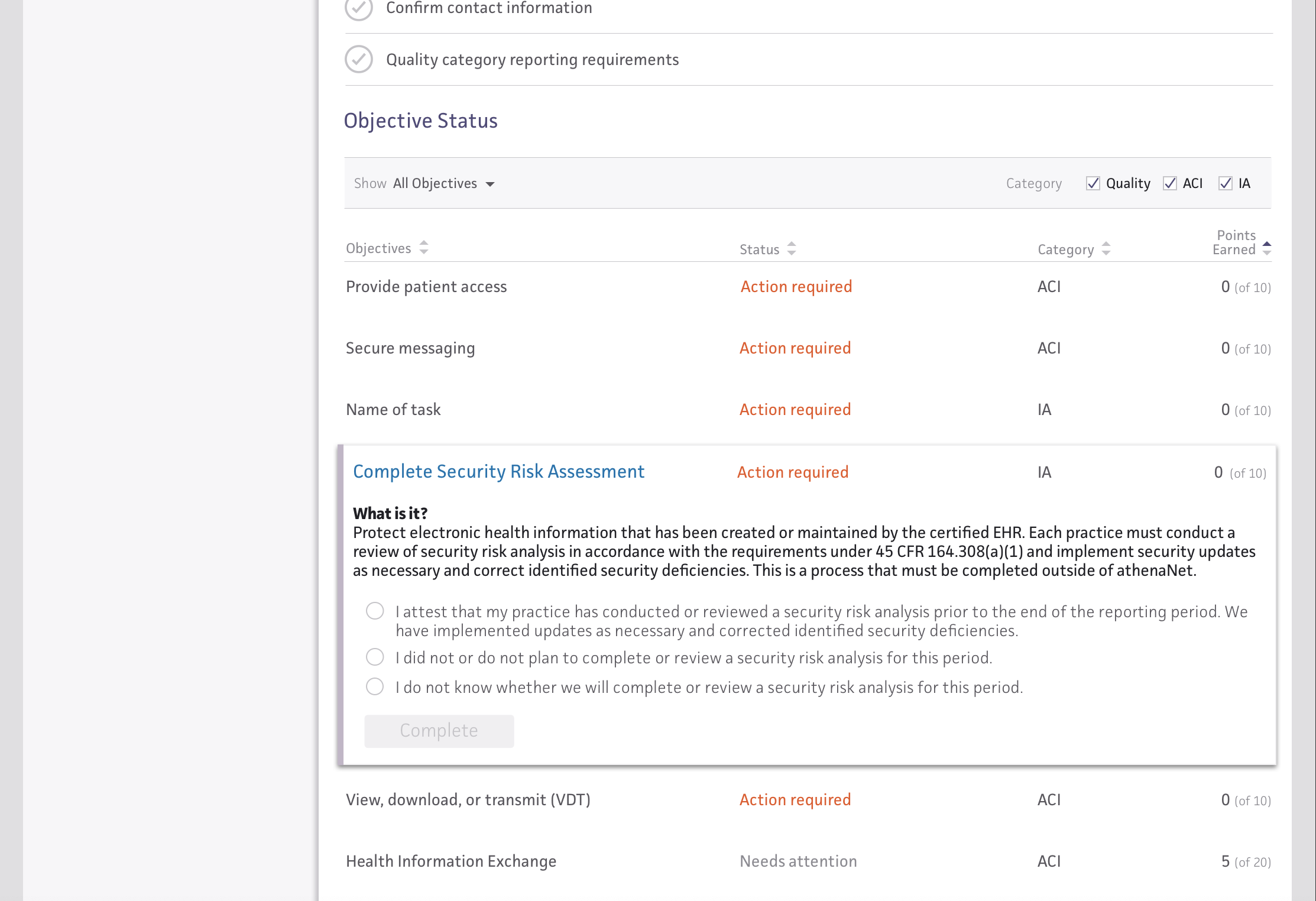
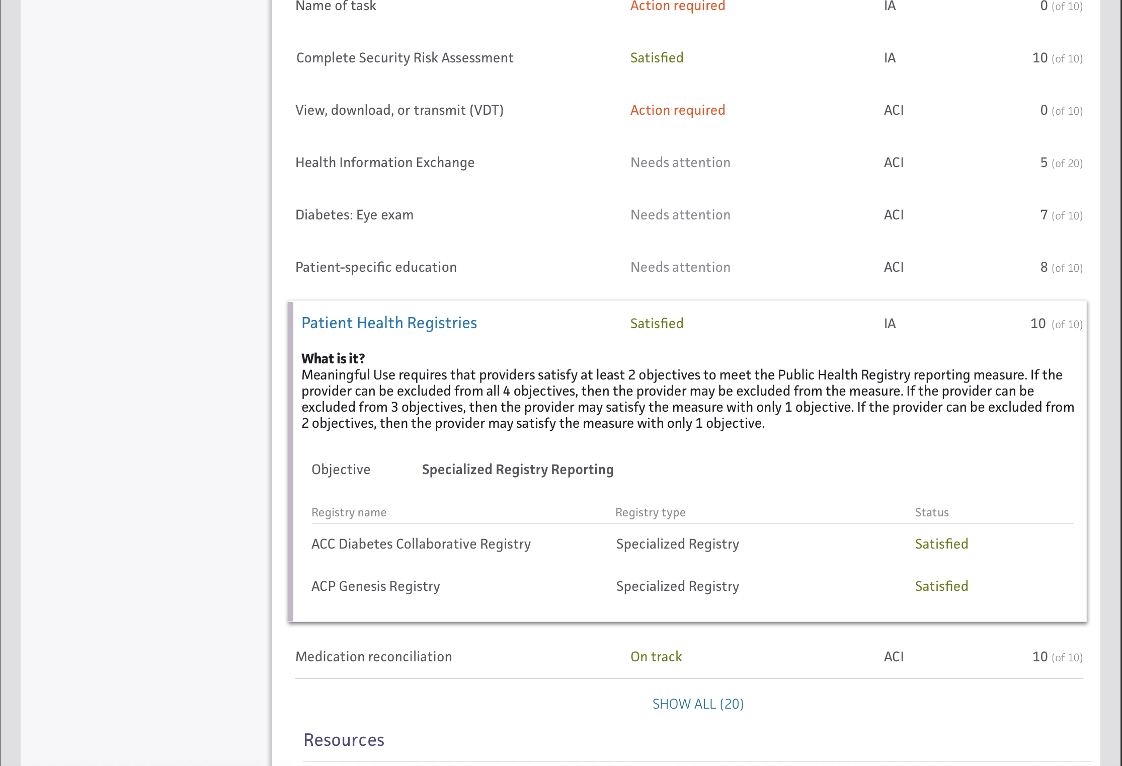
Education needs to be tailored to provide aid for specific MIPS category problems and pain points.
3. Avoid CMS Financial Penalties
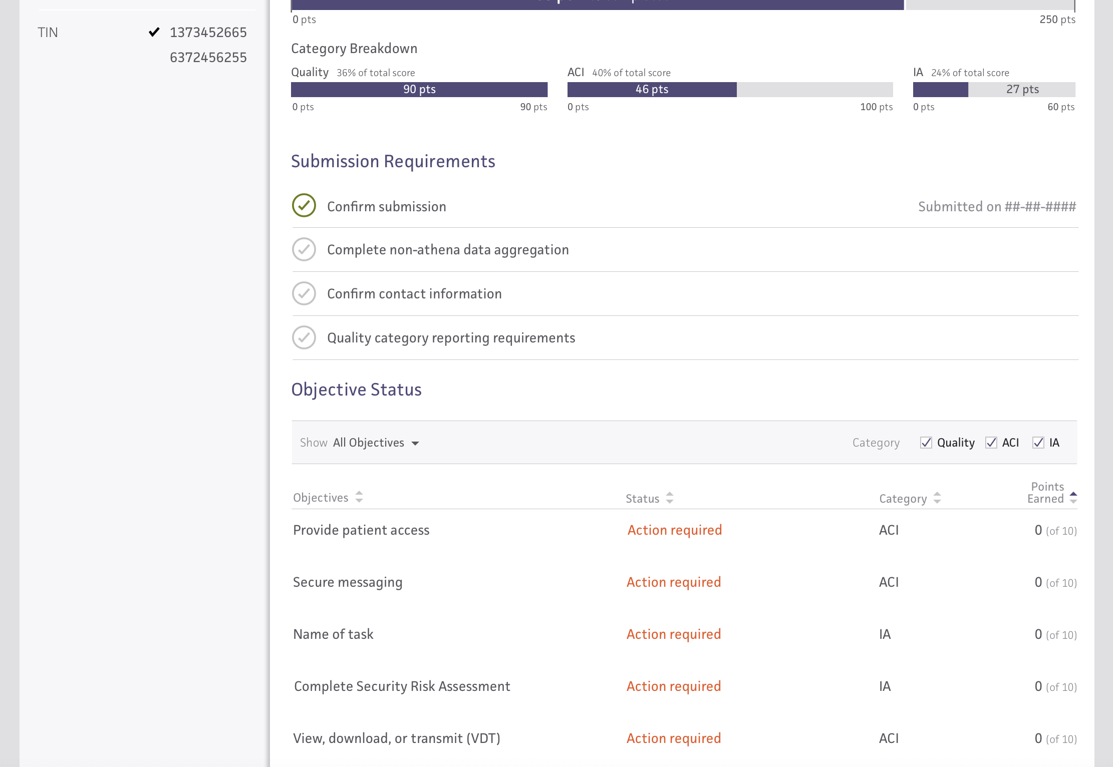
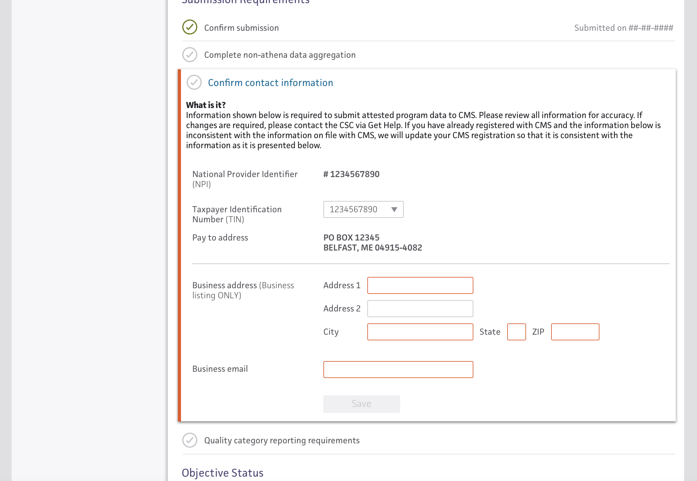
MIPS data needs to be sent to CMS to avoid financial penalties and to possibly gain bonuses.
Workflow & Process
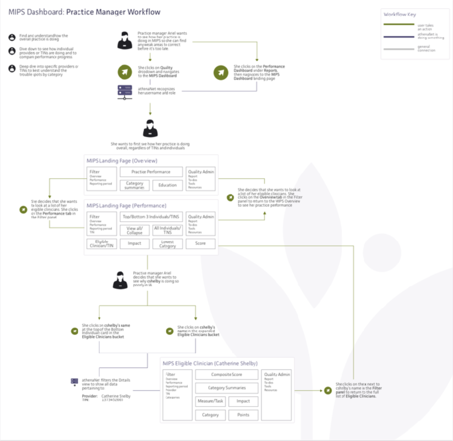
The MIPS Dashboard went through an intense process. It started with a large kickoff meeting with a cross-functional team before moving on to brainstorming, concepting, wireframing, user testing, and finally building.
The team consisted of:
- 1 Product Innovator
- 5 Developers
- 1 UX Designer (myself)
It spanned 8 months of my time and required the changing of a tech stack and web optimization to make sure it would function properly for practice managers. Throughout the development period, we spoke with practice managers and "MIPS" power users who had studied the new program's extensive guidelines. Using their feedback, and understanding the feasibility of what we wanted to do led to the creation of a dashboard that was both functional and delightful.
User Research
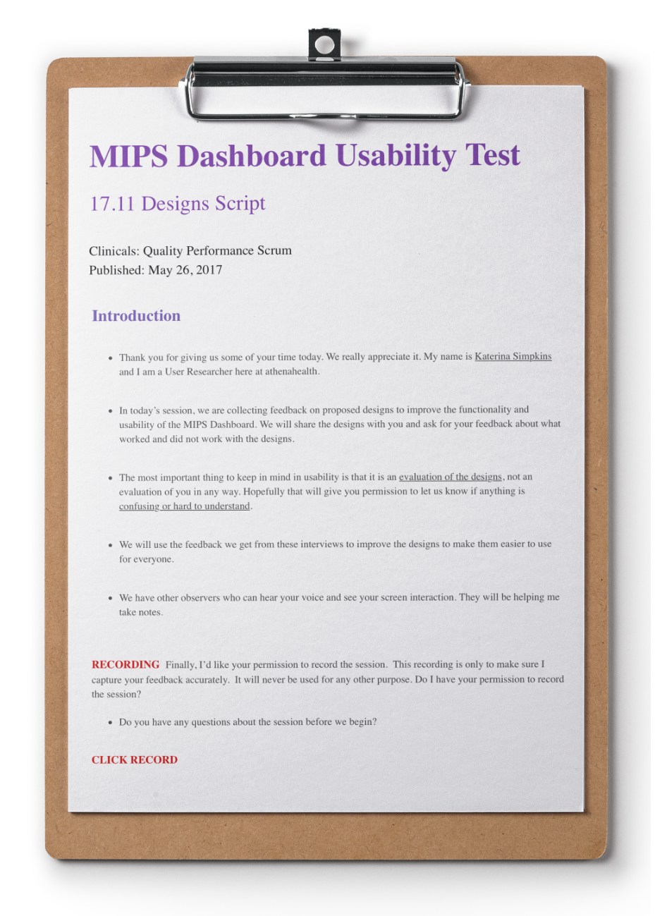
I used multiple methods in testing the current MIPS designs, as well as the designs that I was building for the final version.
Survey blast to all MIPS clients
1. Understand engagement levels
2. Quick and simple feedback on the
educational material we provided
3. Recruit for alpha
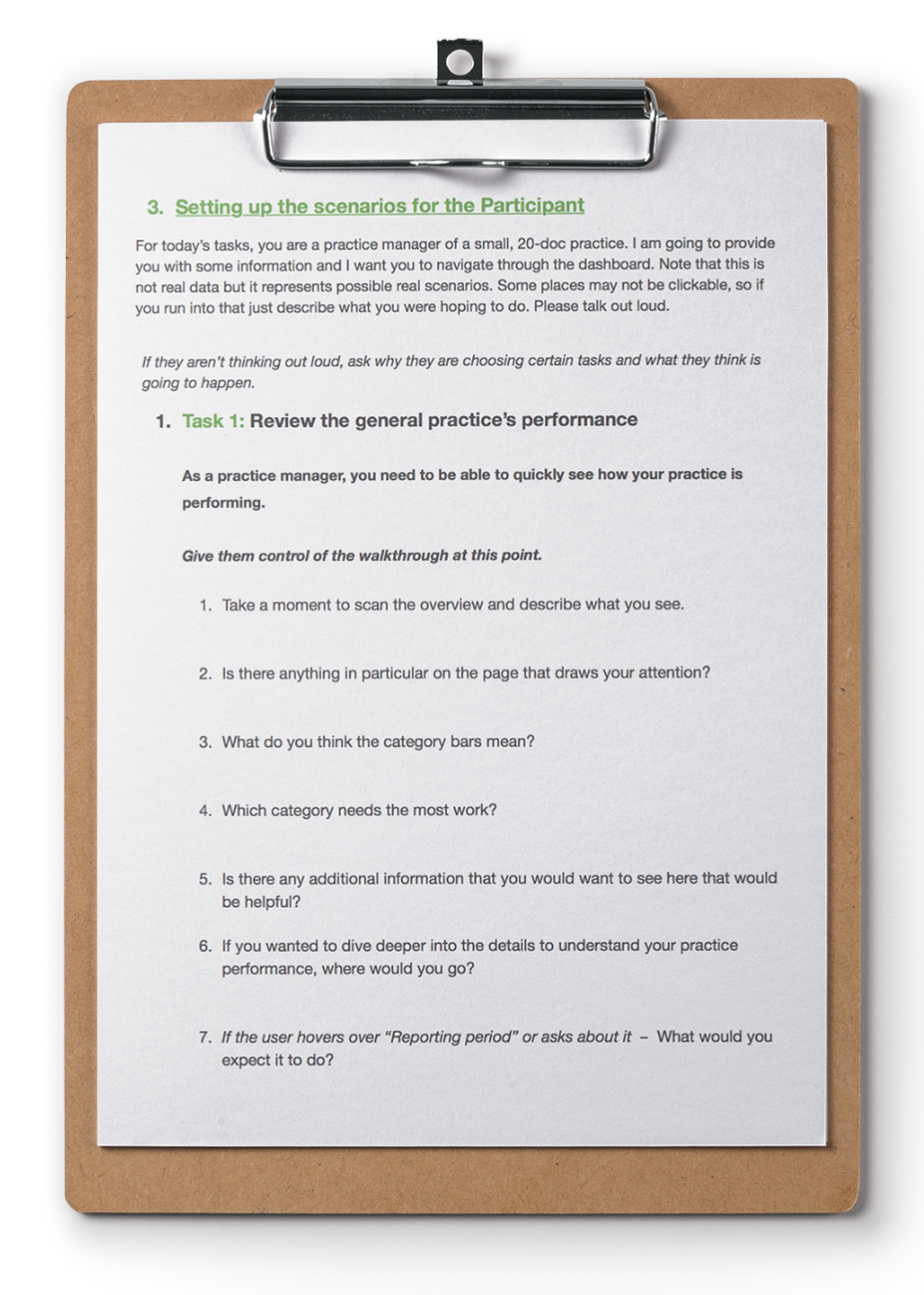
Listening tour
1. Gauge how the alpha was going
2. Show some workflow concepts to
validate the new direction
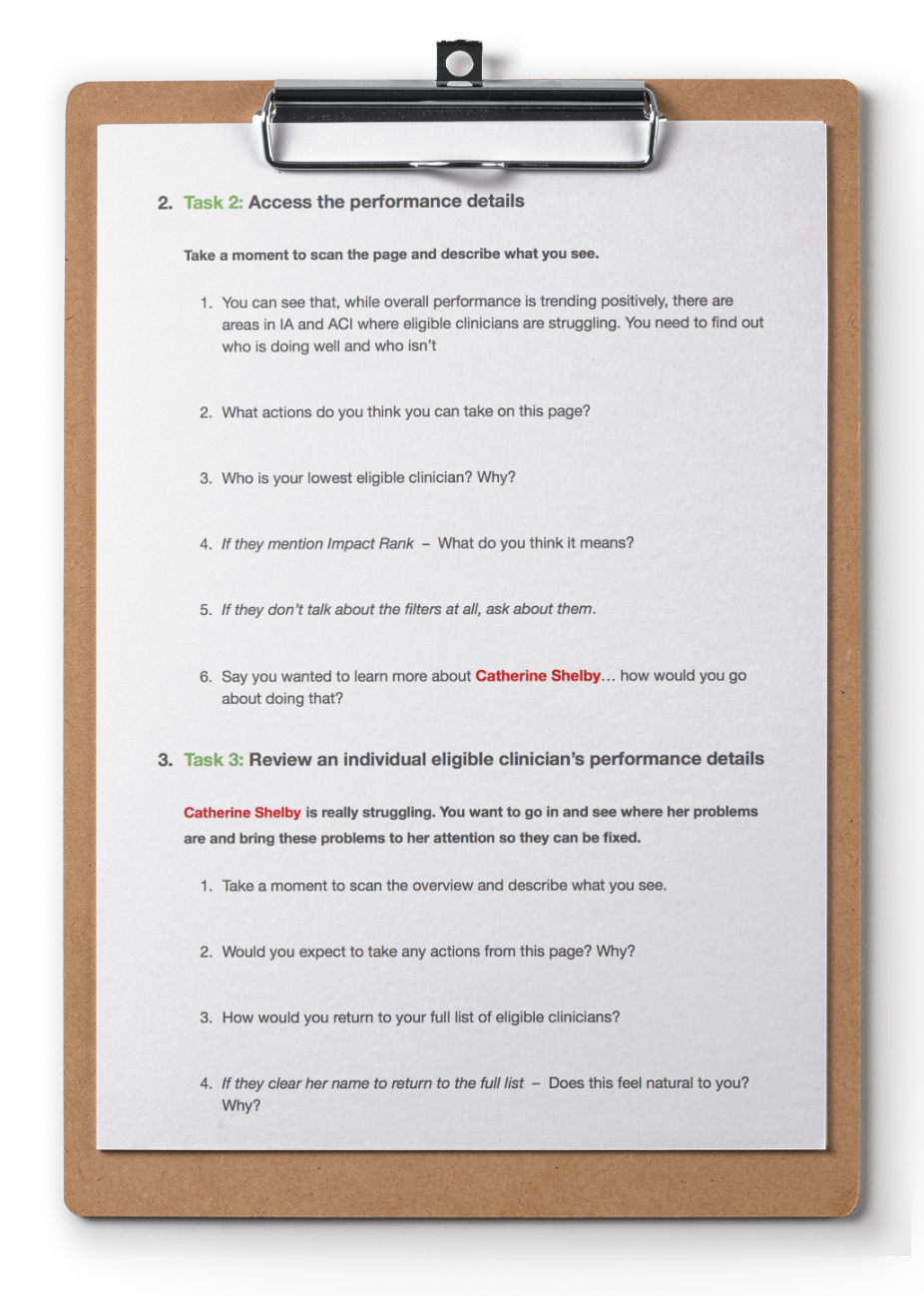
Usability study
1. Test new workflow
2. Understand where there were gaps in
functionality
3. Validate design assumptions


My work
Hotels Business to Business - Phase 1TripAdvisor | Product Design
Creating a Design SystemTripAdvisor | Product Design
MIPS Performance Dashboardathenahealth | UX Design
Updating our Unified Purchase PathTripadvisor | Product Design

Reputation ManagementTripadvisor | Product Design

